Monday, March 14, 2011

Android App Wireframes


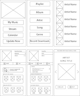
This is the wireframe set up for an android app, Kelcie and I would like to call Music Lab. With Music Lab you can instantly stream music from your favorite artists, buy songs/albums from your favorite artists, view information about their upcoming shows/cd releases, basically anything involving your favorite artist in the palm of your hand.

To take you on a quick walk through, if you started at the main page [frame 1] and selected music, it would take you to the categories page [frame 2], click on Artist which would take you to your artists catalog [frame 3], If you were to click on an artist, that would take you to the artists main page [frame 4]. At the artists main page you would be able to learn about the artists background, go into their list of albums, find out if there is a cd release or concert in your town with the calendar, check out their top songs or similar artists. If you were to click on a top song (or any song for that matter from an artist) it would take you to the song page [frame 5] which fills you in on information about that specific song. The song page has the options of seeing the lyrics, finding out the album appearances the song has made (soundtracks, ep's etc.), along with youtube videos that the song could be found in, live versions of the song or music videos for the song. You can play the song while you are browsing the song page, or if you click on the album picture it would take you into a blown up section with the album art [frame 6]. There you can find similar artists with similar song type or buy that distinct song.

Wednesday, March 9, 2011

Week 5 Reading

I think its funny that Krug brings up the difference between the developer and the designer because I can completely relate and agree to the designer aspect. Even when building interfaces I have a tendency to try and make things just look great. While developers are looking for a website with original and elegant ideas. Either way working in teams can prove to be tough when everyones personal beliefs get in the way. It's not productive to ask questions like "Do most people like pulldown menus?" You have to be really specific with the question and think of the design aspect rather than your personal beliefs on the subject. However, the best way to decipher whether or not to use that pulldown menu is by doing a usability test. Usability testing can sometimes be confused with focus groups, but there are differences. A focus group is a small group of people (between 5 to 8) that sit around a table and react to ideas and designs that are shown to them. It's a group process, so the majority of this value comes from participants reacting to one another's opinions. Focus groups are good for quickly obtaining a sampling of user opinions and feelings. Now usability testing, brings one user in at a time and shown a website, a website prototype or sketches of individual pages and asked to either figure out what it is or to navigate a simple task.

Thursday, February 10, 2011

E-Commerce Mood Board


E-Commerce Mood Board for 80stees.

Week 4 Reading

A websites homepage can make or break a user ever coming back to your site. You want the users to be able to easily navigate your site and know exactly where they want to go. Like the last blog post, having a 3 year old navigate your site would be a wise way of thinking about building your site. You don't want to over complicate things by adding in unnecessary information, but if you have to have promotional banners they should be accompanied to your site accordingly. There are many ways the structure of the site can make or break someone coming back to your website, if you have a massive mess of a page like many of the websites that came out when the internet was first created, then good luck getting large quantities of viewers. Use as much space as necessary to complete the goals of your website. Keep the jargon and long paragraphs down to a minimum, bullet things creatively if you need to. Refrain from using drop down menus unnecessarily, keep them for forms or specific products. And if you do use drop down menus, make sure they are alphabetized for convenience. If you design to use a roll over bubble, make sure the bubble is in a close range of where you rolled over. For user purposes it is really inconvenient to have to look at the lower left hand corner of the screen to read something, just to have to look back up again to figure out where you need to roll over next.