Monday, March 14, 2011

Android App Wireframes


This is the wireframe set up for an android app, Kelcie and I would like to call Music Lab. With Music Lab you can instantly stream music from your favorite artists, buy songs/albums from your favorite artists, view information about their upcoming shows/cd releases, basically anything involving your favorite artist in the palm of your hand.

To take you on a quick walk through, if you started at the main page [frame 1] and selected music, it would take you to the categories page [frame 2], click on Artist which would take you to your artists catalog [frame 3], If you were to click on an artist, that would take you to the artists main page [frame 4]. At the artists main page you would be able to learn about the artists background, go into their list of albums, find out if there is a cd release or concert in your town with the calendar, check out their top songs or similar artists. If you were to click on a top song (or any song for that matter from an artist) it would take you to the song page [frame 5] which fills you in on information about that specific song. The song page has the options of seeing the lyrics, finding out the album appearances the song has made (soundtracks, ep's etc.), along with youtube videos that the song could be found in, live versions of the song or music videos for the song. You can play the song while you are browsing the song page, or if you click on the album picture it would take you into a blown up section with the album art [frame 6]. There you can find similar artists with similar song type or buy that distinct song.

Wednesday, March 9, 2011

Week 5 Reading

I think its funny that Krug brings up the difference between the developer and the designer because I can completely relate and agree to the designer aspect. Even when building interfaces I have a tendency to try and make things just look great. While developers are looking for a website with original and elegant ideas. Either way working in teams can prove to be tough when everyones personal beliefs get in the way. It's not productive to ask questions like "Do most people like pulldown menus?" You have to be really specific with the question and think of the design aspect rather than your personal beliefs on the subject. However, the best way to decipher whether or not to use that pulldown menu is by doing a usability test. Usability testing can sometimes be confused with focus groups, but there are differences. A focus group is a small group of people (between 5 to 8) that sit around a table and react to ideas and designs that are shown to them. It's a group process, so the majority of this value comes from participants reacting to one another's opinions. Focus groups are good for quickly obtaining a sampling of user opinions and feelings. Now usability testing, brings one user in at a time and shown a website, a website prototype or sketches of individual pages and asked to either figure out what it is or to navigate a simple task.

Thursday, February 10, 2011

E-Commerce Mood Board


E-Commerce Mood Board for 80stees.

Week 4 Reading

A websites homepage can make or break a user ever coming back to your site. You want the users to be able to easily navigate your site and know exactly where they want to go. Like the last blog post, having a 3 year old navigate your site would be a wise way of thinking about building your site. You don't want to over complicate things by adding in unnecessary information, but if you have to have promotional banners they should be accompanied to your site accordingly. There are many ways the structure of the site can make or break someone coming back to your website, if you have a massive mess of a page like many of the websites that came out when the internet was first created, then good luck getting large quantities of viewers. Use as much space as necessary to complete the goals of your website. Keep the jargon and long paragraphs down to a minimum, bullet things creatively if you need to. Refrain from using drop down menus unnecessarily, keep them for forms or specific products. And if you do use drop down menus, make sure they are alphabetized for convenience. If you design to use a roll over bubble, make sure the bubble is in a close range of where you rolled over. For user purposes it is really inconvenient to have to look at the lower left hand corner of the screen to read something, just to have to look back up again to figure out where you need to roll over next.

Week 3 Reading

Decision wise the web and reality is a lot alike. Take Krug's Sears example; when we walk into a store and are looking for something specific in a millisecond we decide whether or not we will ask someone where to find the object we are looking for or take the stubborn route and look for ourselves. This is the same with navigating a website in the sense that when we get to a sites home page we instantly decide if we are going to browse or if we are going to search for the subject we are looking for. Web designers use the term persistent navigation to describe the set of navigation elements that appear on every page of a site. If this is done right the website should be saying to us "The navigation is over here. Some parts will change a little depending on where you are, but it will always be here, and it will always work the same way." Keeping the navigation consistent between pages is a good idea for user ability to go smoothly however there are two instances where this rule can be changed; with the home page and the forms. The home page has its own set of responsibilities, which means it is ok and sometimes makes sense to not use the persistent navigation here. Also on a page where there is a form that needs to be filled out, the persistent navigation can add up to being an unnecessary distraction. One thing that should remain persistent with the website is the Site ID or Logo. When we walk into a store we only really need to see the store name once, because we know that unless we have walked back out those doors we are still in the same store. However, websites can be tricky with misleading links that can take you to other webpages unexpectedly. This helps to maintain the sanity and security of the user to ensure them they are still where they want to be.

Persistent Navigation So good that even a 3 year old can navigate it.

Monday, February 7, 2011

Week 2 Reading

Hierarchy is important to the design process because as humans we learn to recognize the hierarchy. If any source of media doesn't have a clear hierarchy we're reduced to processing the page at a much slower pace, by scanning the page for any revealing words or phrases and leaving our brains to decipher the code. Another key factor in the design process is making things user friendly; no noise, clearly clickable items, a sense of convention. No one wants to have to learn to navigate a website, by keeping things conventional it makes media more user friendly. In chapter 4 Krug's gives an example of users possibly confusing NAV and "Norton AntiVirus", people at Symantec know they are the same, but it can be a leap of faith for others who aren't as computer literate. The lesson I will be taking away from this example is to keep it simple stupid or to at least provide a clear and concise navigation through any website. Keeping it simple also involves no jargon or over excessive use of the english language. If at anytime you can hear your conscious saying "Blah blah blah blah blah…" you know you have gone too far.


Thinking With Type is a site discussing hierarchy with typography.

How well does your design communicate? A website dedicated to helping you discover visual hierarchy.

Good Website Navigation This one is self explanatory. =D

Thursday, January 20, 2011

Week 1 Reading

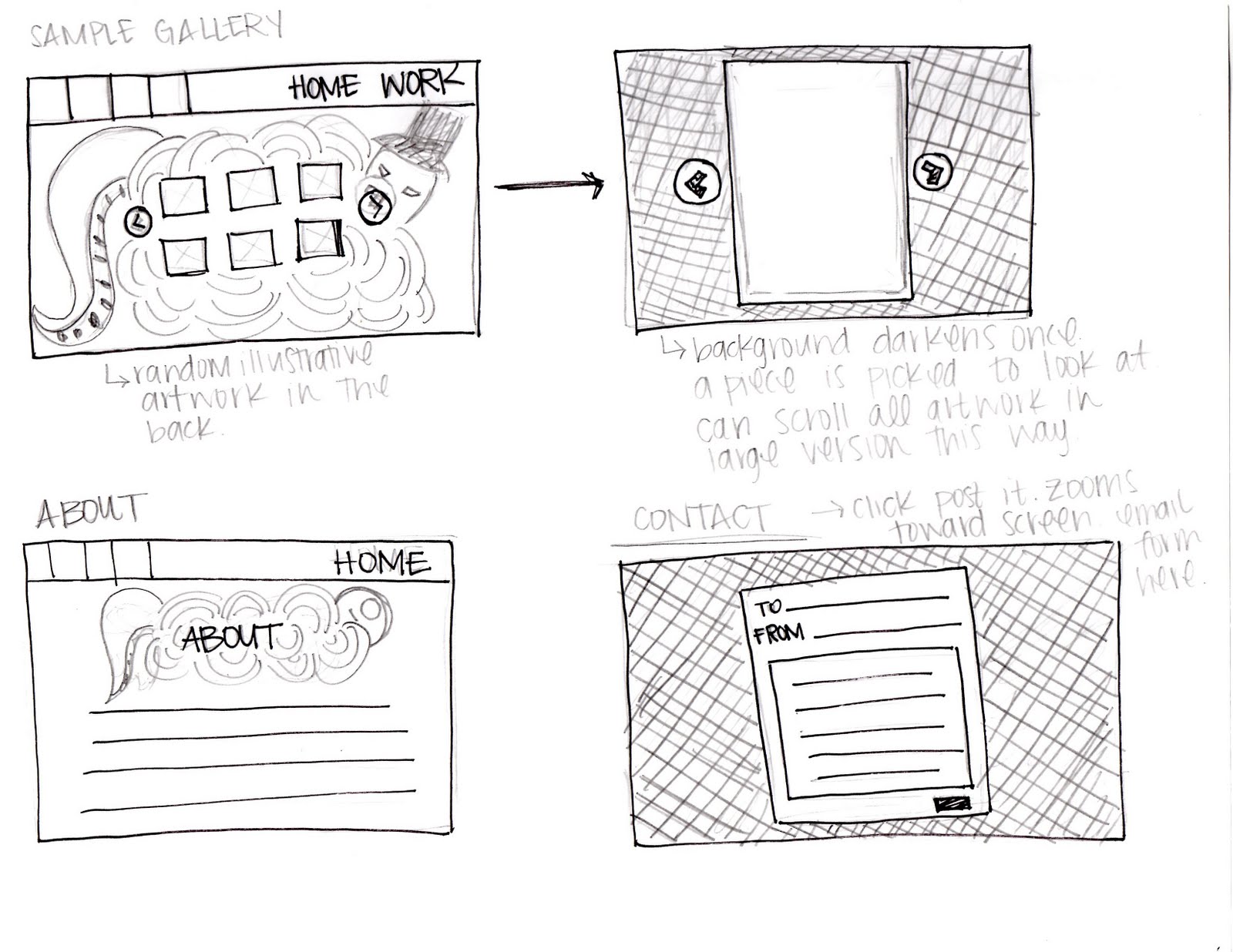
I was shockingly surprised by “Don’t Make Me Think” like the title should have suggested to my brain, it was a very easy read. Unlike other books I’ve had to stumble through with college, filled with designer jargon. I liked that Krug’s made it a simple read. I felt like while I was reading, it could have been made to be a blog about website usability. What I have learned from the Introduction to the end of Chapter 2 is that usability does mean everything to the user’s experience. I found while reading and having Krug’s give examples that I have gone through similar issues with websites. And that I am in the wrong in a designer sense of the aspect. I hadn’t yet read the chapters before sketching up my ideas for my website design. Now having read that, my complex idea of my desk and making that my homepage doesn’t seem all that easy to navigate. I could imagine a person sitting down and stumbling upon my website and being confused. Confused by what to click, and why a certain object took them to some of the locations I had noted. Given his “Don’t Make Me Think” way of the web thinking, I would have to change my homepage design to make it more user friendly.

Website Thumbnail Sketches


For my website I would like to show the "structured mess" of my art life and style. I really enjoy illustrating cute little monsters and cartoon characters. I would like to put my doodles to good use as backgrounds and headers for my design. Hoping that it will show a fun and eccentric personality of its own. There are 3 sites and designers that I used for my inspiration; Penelope Illustration [Penelope Dullaghan] , Paul Blow, and Hugs For Monsters [Joe Lifrieri]. I took most of my inspiration from Hugs For Monsters as I instantly fell in love with his style of choice for his website along with his art. I'm hoping to have a website quite like his in the heavily illustrated sense. I feel that it gives a great personality, amazing flow, and something different to catch the audiences eye on every page.

Wednesday, January 19, 2011

Mood Board


I added two "different versions" of my wordmark on my mood board. I am currently in the process of working out my word mark for my business card in Advanced Electronic Print Production. I chose to include two only because I'm unsure which weight I'd rather have for my wordmark at this time. The darker green wordmark (above) is thicker than the bright green below it. I really enjoy the typeface "High Fiber"
I feel that within the typeface it shows a little bit about my character. I'm slightly all over the place, messy within my own terms, but I can still find everything I need. The color's weren't a hard choice for me to figure out as green and black are my favorite colors. For the background I also have a creamy color, which is textured with a recycled paper look. All photos and artwork I have created myself, I am an avid fan of the pen tool and can often times swear by it. I want to base my website off my style of artwork, photography is just a fun bonus I think I will throw in there.