I was shockingly surprised by “Don’t Make Me Think” like the title should have suggested to my brain, it was a very easy read. Unlike other books I’ve had to stumble through with college, filled with designer jargon. I liked that Krug’s made it a simple read. I felt like while I was reading, it could have been made to be a blog about website usability. What I have learned from the Introduction to the end of Chapter 2 is that usability does mean everything to the user’s experience. I found while reading and having Krug’s give examples that I have gone through similar issues with websites. And that I am in the wrong in a designer sense of the aspect. I hadn’t yet read the chapters before sketching up my ideas for my website design. Now having read that, my complex idea of my desk and making that my homepage doesn’t seem all that easy to navigate. I could imagine a person sitting down and stumbling upon my website and being confused. Confused by what to click, and why a certain object took them to some of the locations I had noted. Given his “Don’t Make Me Think” way of the web thinking, I would have to change my homepage design to make it more user friendly.
Thursday, January 20, 2011
Website Thumbnail Sketches

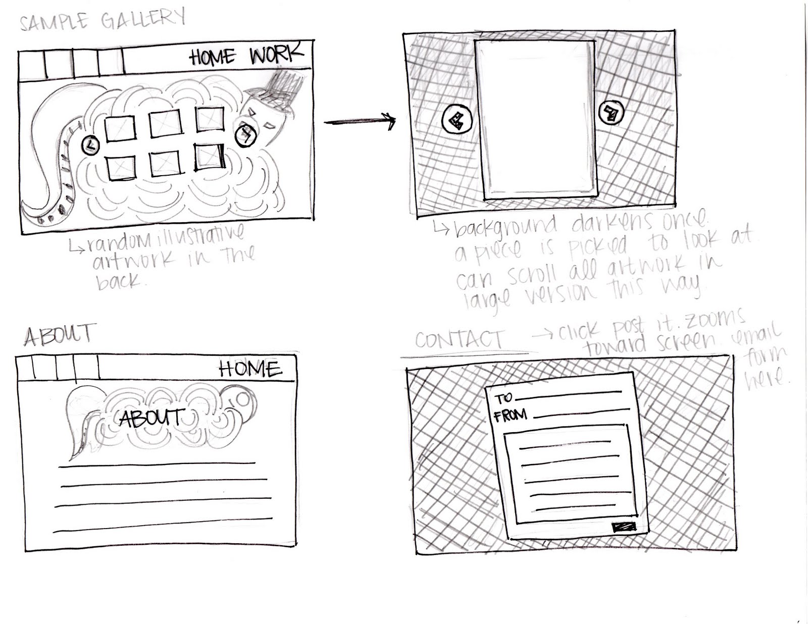

For my website I would like to show the "structured mess" of my art life and style. I really enjoy illustrating cute little monsters and cartoon characters. I would like to put my doodles to good use as backgrounds and headers for my design. Hoping that it will show a fun and eccentric personality of its own. There are 3 sites and designers that I used for my inspiration; Penelope Illustration [Penelope Dullaghan] , Paul Blow, and Hugs For Monsters [Joe Lifrieri]. I took most of my inspiration from Hugs For Monsters as I instantly fell in love with his style of choice for his website along with his art. I'm hoping to have a website quite like his in the heavily illustrated sense. I feel that it gives a great personality, amazing flow, and something different to catch the audiences eye on every page.
Wednesday, January 19, 2011
Mood Board

I added two "different versions" of my wordmark on my mood board. I am currently in the process of working out my word mark for my business card in Advanced Electronic Print Production. I chose to include two only because I'm unsure which weight I'd rather have for my wordmark at this time. The darker green wordmark (above) is thicker than the bright green below it. I really enjoy the typeface "High Fiber" I feel that within the typeface it shows a little bit about my character. I'm slightly all over the place, messy within my own terms, but I can still find everything I need. The color's weren't a hard choice for me to figure out as green and black are my favorite colors. For the background I also have a creamy color, which is textured with a recycled paper look. All photos and artwork I have created myself, I am an avid fan of the pen tool and can often times swear by it. I want to base my website off my style of artwork, photography is just a fun bonus I think I will throw in there.
Subscribe to:
Comments (Atom)